How do you simplify a complex sustainability mission into a brand story people can easily retell?

Stecc Capital is a hands-on investment company focusing on the energy transition and circular economy. Previous investments include Vandebron, Marie-Stella Maris and Sunrock. With a new company name and sharpened focus on the energy transition, Nice Important was tasked to create a brand for ‘Return’ from scratch.
Challenge
Create a standout brand in a saturated category and explain a rather complex brand story in a simple manner.

Approach
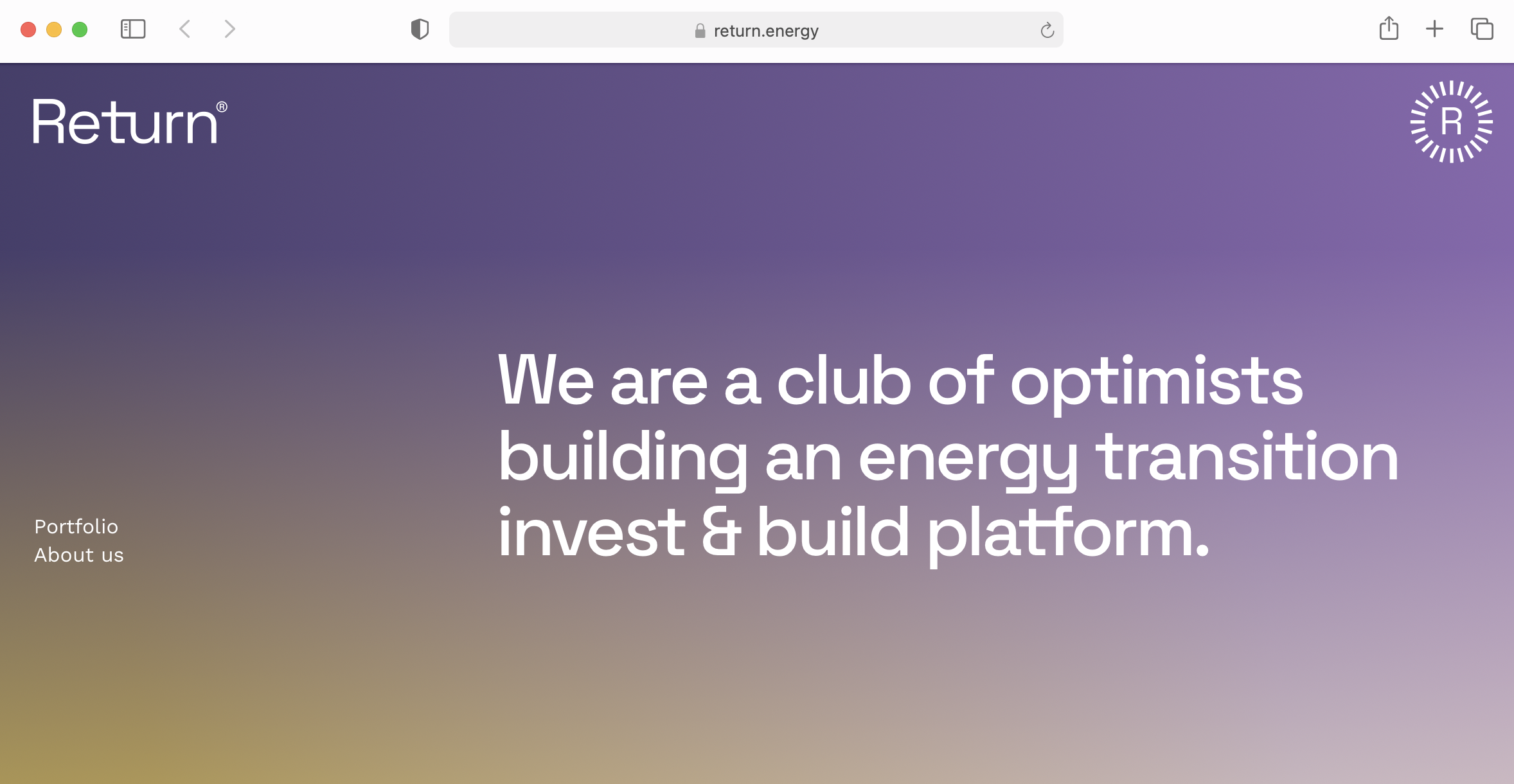
We took the complexity and scale of their mission and translated it into brand fundamentals so simple they could easily be retold at a dinner party, positioning Return as a ‘club of optimists’ who are building an energy transition invest & build platform. From there we created a brand identity and website, distinct from the repetitive aesthetics we’re used to seeing from the sector. As the elements play a huge role in generating and redistributing energy, we started working from there, using a color palette inspired by the ever-changing weather. We then built the website to adapt to the weather too; it takes your current location and mirrors the animation to your local weather report.

Output
- Brand fundamentals & brand story
- Identity design, website design
- Website development
- Development of Keynote templates, Investor deck
- Team photography, brand photography
- Brand photography
- Check out the Return website here.


